Choosing colors for your slides is one of the most important decisions to make even before you start working on your Google slides or PowerPoint presentations. Basically, color can help you convey your message more effectively and can evoke many different feelings or emotions in your audience. Read on to learn how to choose the best colors for your presentation.
Color Psychology
It is important to understand how your audience perceives colors and how they relate to the topic you are talking about. For example, red can convey a sense of danger, but it can also convey love, depending on the context. These are some common meanings of colors to humans:
- Red: Evokes passion and strength. It’s an energetic and intense color that represents power and determination. It’s usually present on brands related to beverages, gaming and the automotive industry.
- Blue: Conveys a sense of security, confidence, responsibility and calmness. It is the most representative color in the healthcare and finance industries.
- Yellow: This is the color of light. It is a stimulating color that conveys energy, awakes awareness and inspires creativity. You will surely find yellow in the food industry.
- Green: Undeniably, the color of nature, life and peace. This color conveys a sense of growth, balance and stability like no other. It is quite popular among big companies, especially in the energy and tech industries.
- White: It is considered the color of purity and innocence. When it comes to evoking simplicity, optimism and integrity, white is second to none. You will find it for sure in the healthcare industry, and it is making its way in the fashion industry too.
- Black: Even though black is associated with seriousness, it can also convey elegance and courage. Fashion brands and luxury products make good use this color.
Take note of these hints and try to choose the color that best suits your message. For example, in this template we used bright and vibrant colors, since it is an education-themed presentation intended for a very young audience:
Color Temperature
Colors can be grouped based on their temperature, which can be determined by comparing any given color in the visible spectrum with the light that a black body would emit when heated at a specified temperature. So, according to their temperature, there are two groups of colors:
- Warm colors: These range from red and orange to yellow.

- Cool colors: These range from green and blue to violet.

Mainly, warm colors convey energy and optimism—it is like giving a warm reception to your audience. On the other hand, cool colors are associated with serenity and confidence, just what you need to have a peaceful time.
Neutral Colors
White, black and all shades of gray are not considered neither warm nor cool. In fact, we could say colors such as creme, beige, brown and others with a high amount of gray are also neutral.
These colors do not influence others and can actually be combined with almost any color. As for their meaning, elegance and solemnity are pretty much guaranteed, as well as harmony.
When combining neutral colors, oftentimes a bright color is used as a contrast to highlight certain elements and bring them to the front.

Some Tips on How to Combine Colors for Your Presentation
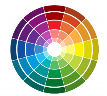
To achieve a nice color harmony and make the most of it, it is best if you take into account the color wheel, as well as the concepts of hue, saturation and brightness.
- Hue is basically what differentiates a color from any other. Thanks to the hue, you can visually tell apart red from blue, for example.
- Brightness defines how light or dark a hue is, and measures its capacity to reflect white light.
- Saturation refers to how pure a hue is. A saturated color appears more vivid, whereas a desaturated color looks duller.

With this information, you can make several different combinations:
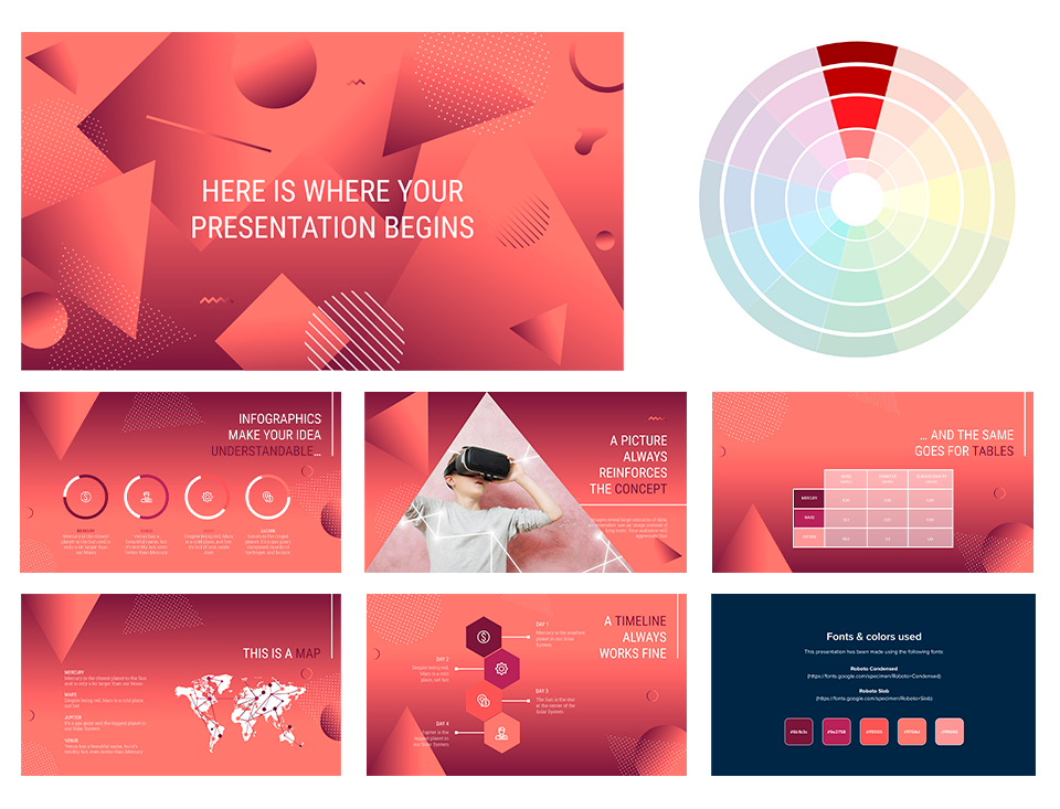
- Monochromatic Color Scheme: These contain different shades of a single color. Click on the footer to see one of our monochromatic templates based on red.

- Complementary Color Scheme: These are composed of a pair of opposing colors on the color wheel. If you click on the footer below, you will be able to download a presentation template with this scheme.

Analogous Color Scheme: This scheme includes colors that are adjacent to each other on the color wheel. Click on the footer to see an example of this scheme applied to a presentation:
Triadic Color Scheme: This uses three colors equally spaced on the color wheel. Click on the footer to download a presentation that makes use of the triadic color scheme.
In order to get the best combination, you will need to consider how many colors you will use in each slide and how you will manage the contrast between them. These should also be suitable for your intended message or your brand.
Finally, try not to overuse very intense colors—use them only for emphasis. Keep everything consistent by applying the same color to each instance of an element within your presentation (for example, use the same color in all the titles). Include illustrations or pictures that work well with the chosen palette.
Some of our templates include color variants, making it so much easier for you to adapt them to your topic and/or brand. Just click one of the options that you will find below “Themes” on the right side of the screen.


