
In data presentations using PowerPoint, charts are a valuable tool to help your audience interpret numerical information. When designed effectively, charts are not only easy to comprehend but also highly adaptable. One of their key advantages is the wide range of formats available.
In this discussion, we will focus on radial charts—a visually engaging and practical option that can be applied in marketing strategies, lesson plans, project proposals, and more. If you’re seeking to enhance your presentations with diverse chart types, continue reading to discover how to create a radial chart in PowerPoint.
Creating the outer body of your radial char
- In your PowerPoint presentation, select the slide you want to create the radial chart in.
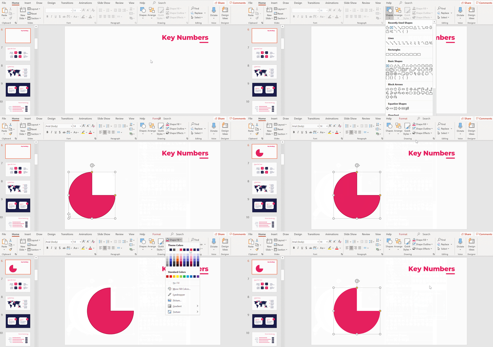
- Under Drawing, click on Shapes → Basic Shapes → Partial Circle.
Click and drag out the pie. Hold down Shift while doing so to maintain its proportion. - If you want to change its color, go to Shape Fill and fill the pie with one of the template’s main color themes. For a more coherent look, make its borders transparent by selecting No Border in Shape Outline.
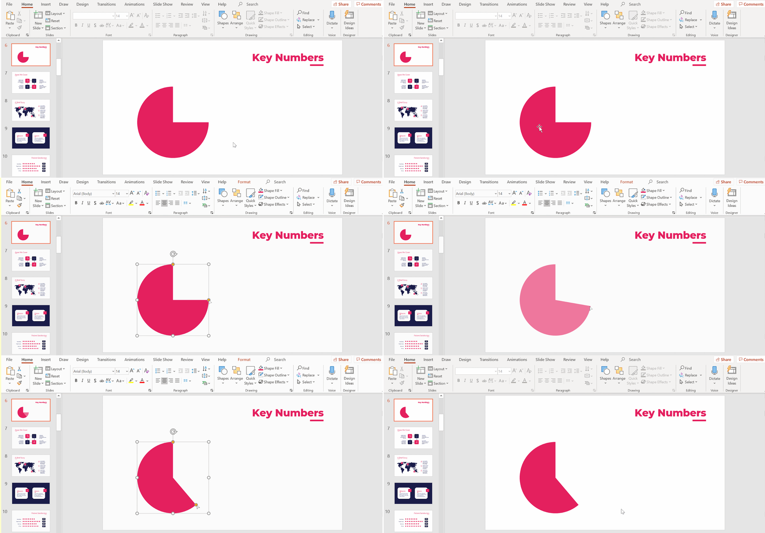
- We will now rescale the pie. Click on it and a selection square with dots will appear.
- Hover your cursor over any of the yellow dots and you’ll notice that it’s now a four-headed arrow. Click and drag the yellow dot.
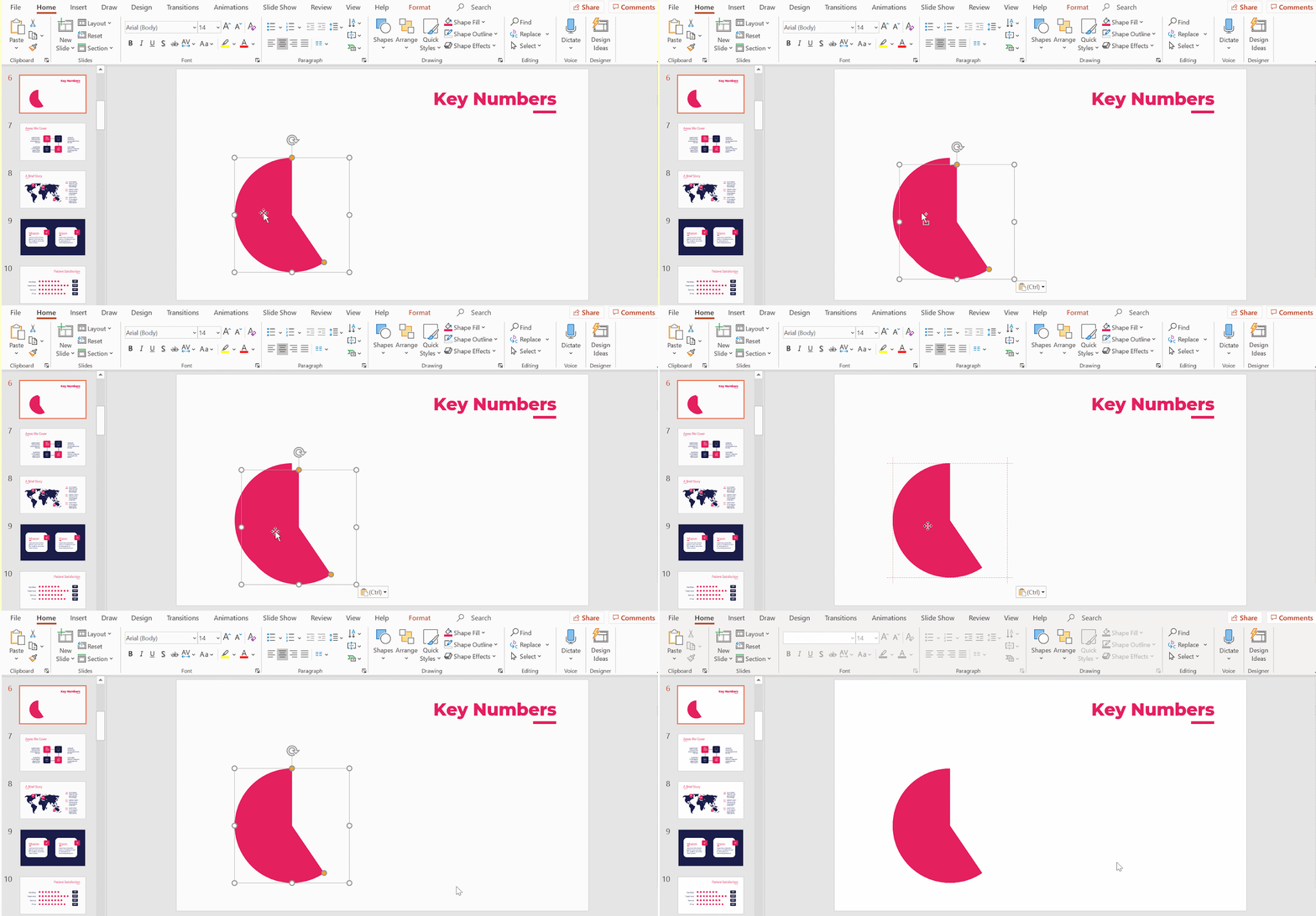
- After creating your radial chart’s main outer body, duplicate it with copy and paste (Ctrl C + Ctrl V or Cmd C + Cmd V in Mac). We will use the duplicate to create the secondary piece of your radial chart’s outer body.
- Position the second pie right over the first. Make sure it’s completely covered such that both appear as one pie. To ensure they’re properly positioned, make use of the red lines. These are PowerPoint’s integrated visual guidelines.
- To differentiate between the pies, rotate the duplicated pie. Bring up its selection square by clicking on it. Now, click on the rounded arrow to its north and drag it to rotate it.
Pro tip: For a more accurate rotation, holding down Shift allows you to rotate it in 15º increments.
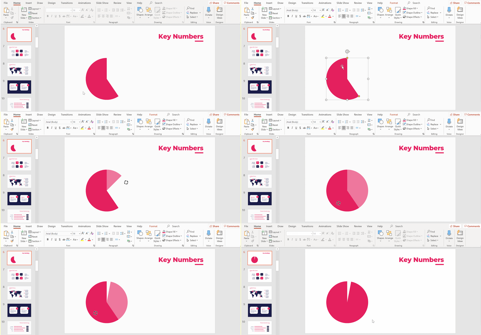
- We will now resize the second pie. Click on it to bring up the selection square and drag the yellow dot to resize.
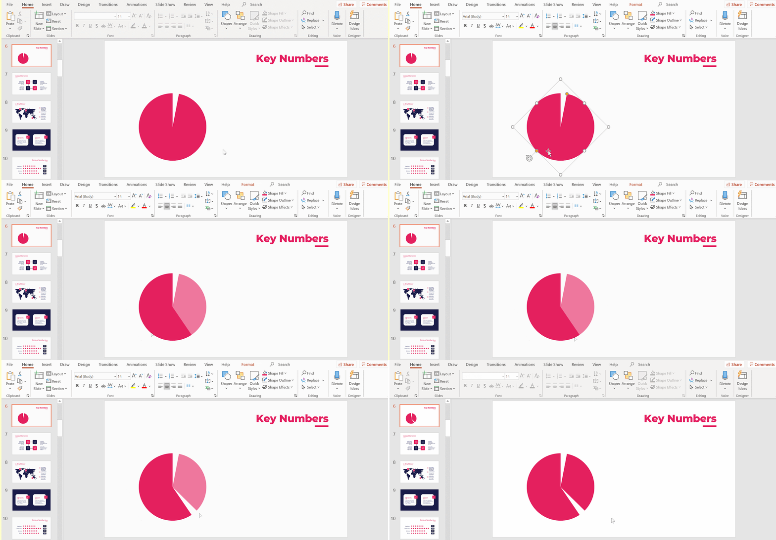
- We need to reduce the size of this secondary piece. Select it and click on any of the white dots along its selection square and drag it inwards.
- You will need to separate the pieces a little. Position the secondary piece away from the first. Now reduce its size bit by bit until it is aligned with the main piece. Do this until the combined outlines of both look like a circle.
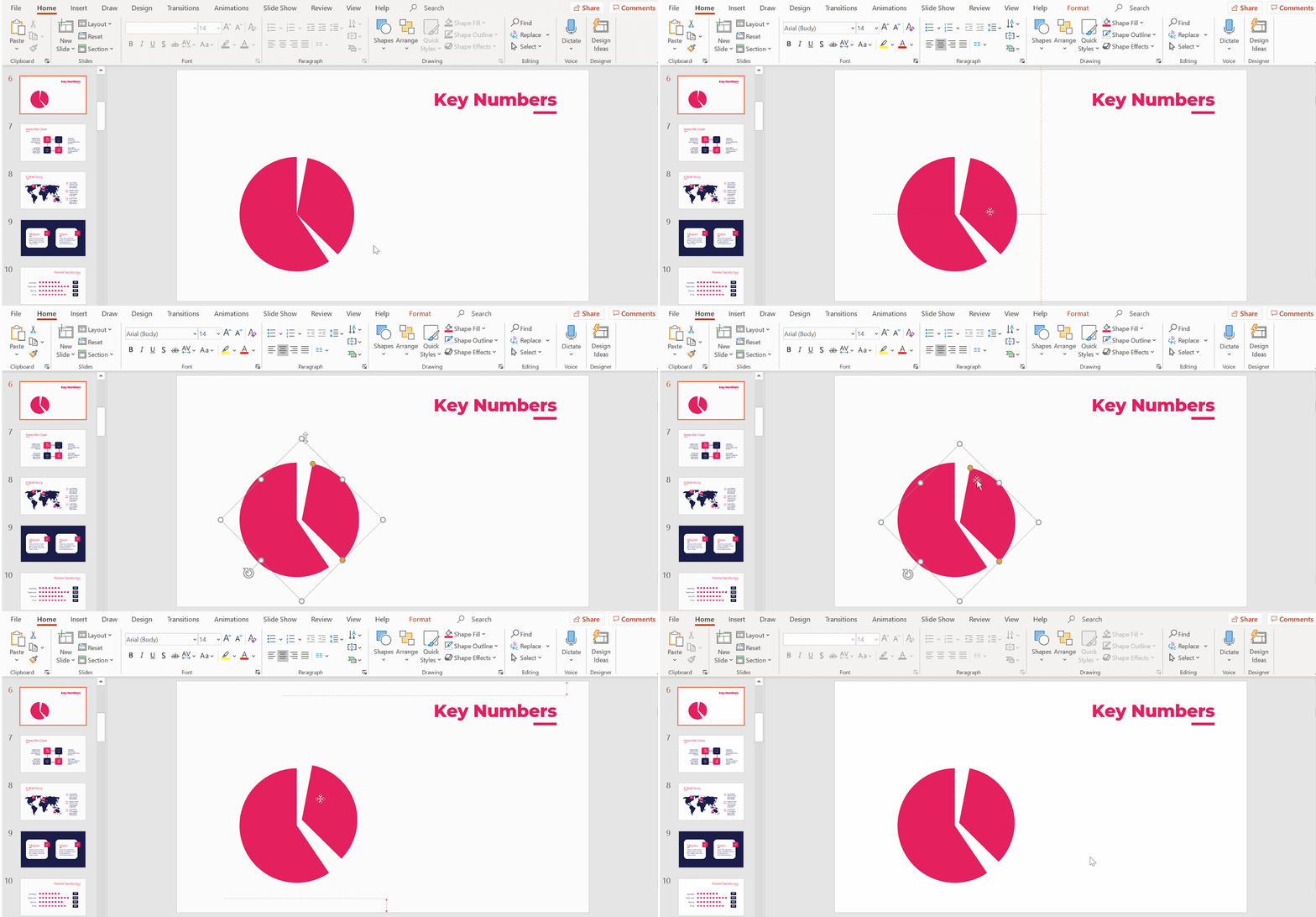
- Fine-tune the second (smaller) piece’s area. To do that, drag the yellow dot on the selection square until the radial lines of both pieces are parallel to each other.
- Continue tinkering with its position until both pieces are aligned.

Creating the inner body and styling it
- We will now create the radial chart’s inner body. Duplicate the first piece (Ctrl C + Ctrl V or Cmd C + Cmd V in Mac).
- To make the piece smaller, click and drag any of the corner points along its selection square inwards. Don’t forget to hold down Shift. Now place the smaller piece over the larger piece such that both center points meet.
- To edit its style, use Shape Fill. We recommend using another color of the template’s main color themes for a coherent contrast.
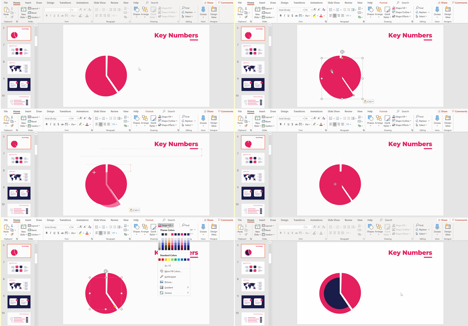
- We need to repeat the same steps to create a secondary inner body. Duplicate (Ctrl C + Ctrl V or Cmd C + Cmd V in Mac) the secondary outer body. Once you have the duplicated piece, make it smaller by rescaling it.
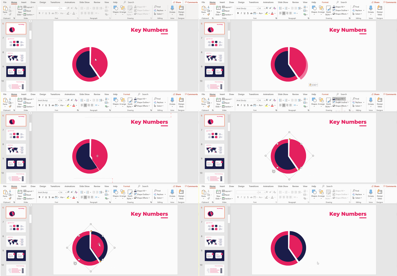
- Move its position until the radial lines and center points of both pieces align.
- Fill this secondary outer body with another color. To create contrast, choose one that offers visual consistency with the overall style and theme of the template.
Adding data labels to the radial chart
- We will now create the radial chart’s first label. Select Rectangle: Rounded Corners from Shapes.
- Click and drag to create the rounded rectangle.
- Using Shape Fill, apply the radial chart’s secondary color to the label. For consistency, remove its outline by selecting No Outline from Shape Outline.
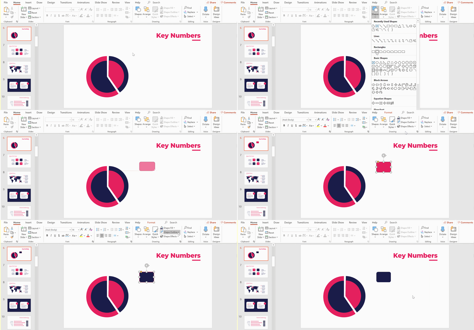
- To create the second label, simply copy and paste the first (Ctrl C + Ctrl V or Cmd C + Cmd V in Mac).
- Position it next to the first label. To ensure they’re on the same horizontal plane, use PowerPoint’s visual guidelines.
- Apply the other theme color used in the radial chart with Shape Fill.
Related tutorial: How to Arrange and Align Objects in PowerPoint
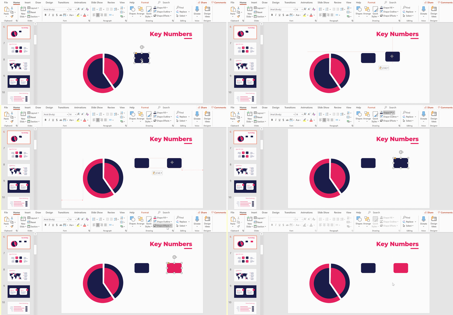
- To fill in the labels, double click on them.
- If you want to style the text, simply select it and use the formatting options that pop up (Font, Font Size, Font Color, Alignment, Bold, Italic, etc) to edit it. Don’t forget to continue using the template’s typefaces and colors. Make sure your text is centralized for a more elegant presentation.

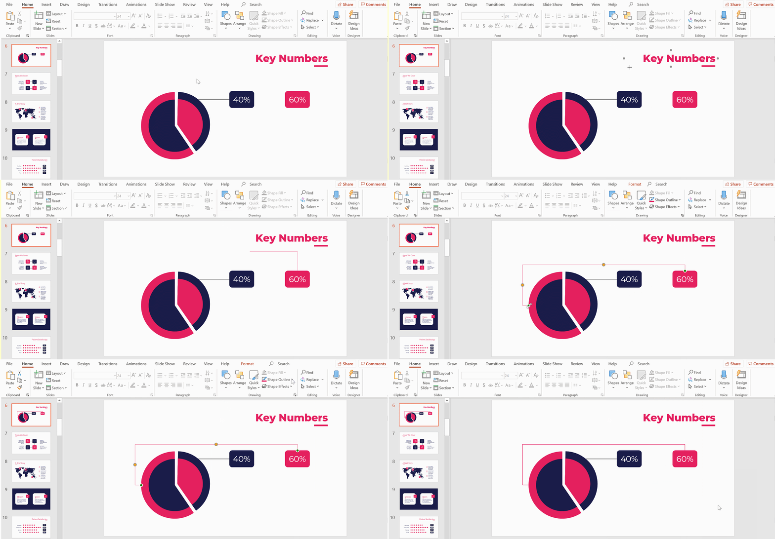
- We now need to assign the labels to the radial chart by connecting it. In Drawing, select Line. While holding down Shift, click and drag from the label to the radial chart (or vice versa) to create a horizontal line.
- To edit the line style, in Shape Outline, use Weight to adjust its thickness. PowerPoint’s lines are usually pretty thin. We recommend making it thicker for visibility. Change the line’s color by selecting any of the colors in Shape Outline. However, we recommend that you stick to the themes’ color palette.

- To connect the second label to the radial chart, we need another type of line. Click on Connector: Elbow (under Drawing → Lines). This ensures the lines don’t criss-cross.
- With this selected, hover over the second label to bring up its outline with four grey dots.
- Click on any dot and drag your cursor to your radial chart. Voila! The second label is now connected to your chart. Remember to edit the line weight as you did with the first so that both are consistent.
Adding titles and descriptive texts
- Go to the Insert tab, and then select Text Box. Click and drag out the boxes you’ll write your titles in. Remember to maintain the template’s typefaces and color.
- When positioning your text boxes, ensure that they are centrally aligned under their corresponding labels.
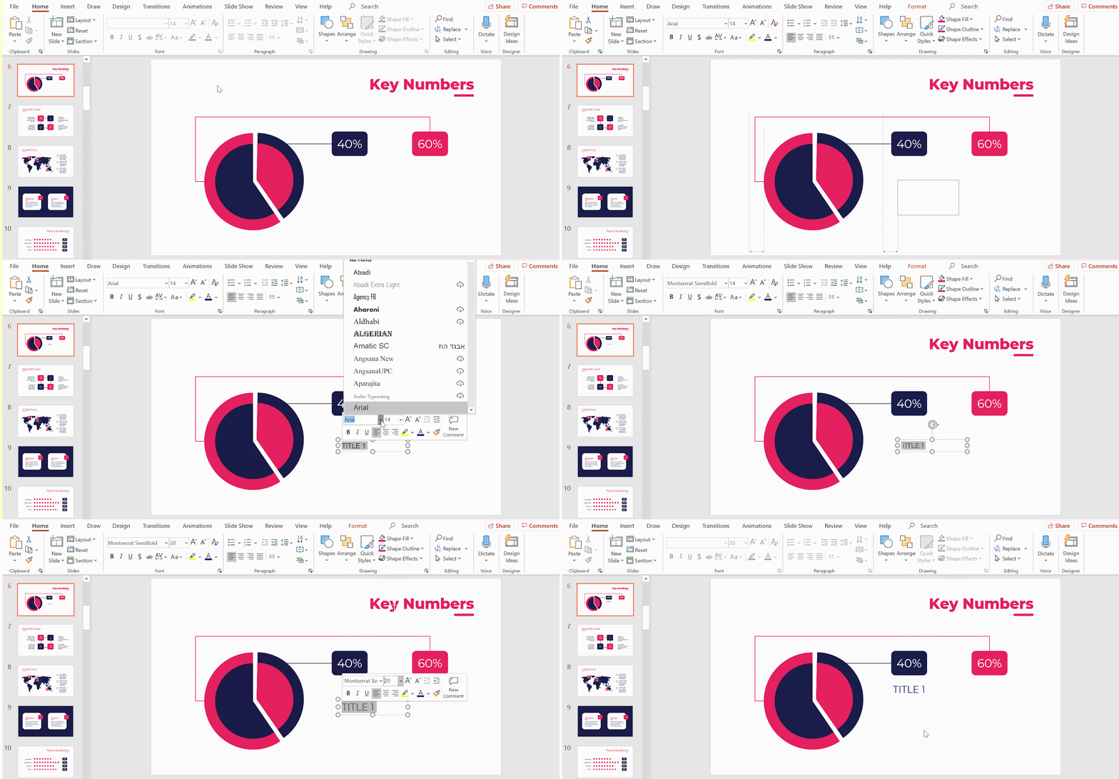
- Duplicate the text box with Ctrl C + Ctrl V or Cmd C + Cmd V in Mac.
- Position the second text box underneath the second label. Do it such that it’s properly aligned with the first text box and its label. Use PowerPoint’s visual guidelines to help you with this.
- Fill in your text.

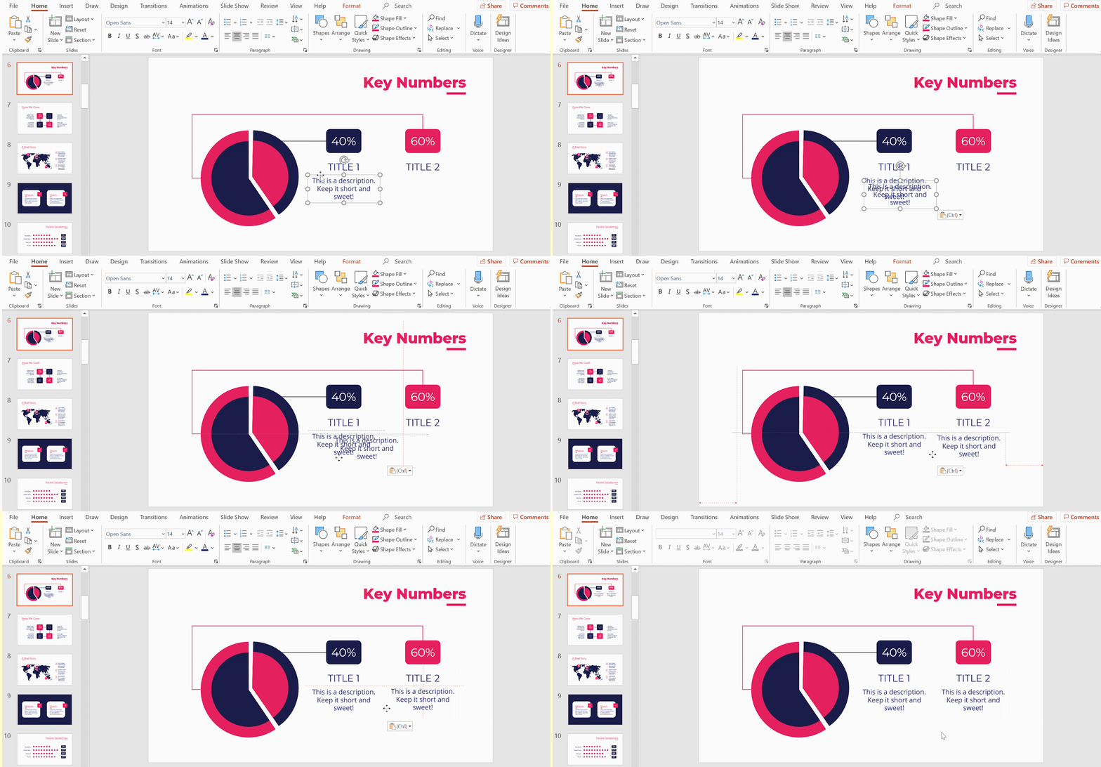
- We’ll now add descriptions. Select the option Text box again.
- Create a text box under the titles, making sure it’s centrally aligned, and fill it in with a desired description.
- Don’t forget to centralize the text for a neater look.
Related tutorial: How to Format the Text in PowerPoint

- Copy and paste (Ctrl C + Ctrl V or Cmd C + Cmd V in Mac) to the first description text box.
- Using PowerPoint’s red lines as a visual guideline, align it properly next to the first description text box and under its corresponding title.
- Wonderfully done! You now have a radial chart in your PowerPoint presentation that’s both practical and visually appealing!
If you prefer to work with a ready-made chart, GreatPPT offers a huge spectrum of PowerPoint templates for you to edit and personalize as you wish. Check them out now!
